FacadePipeline
Facades, in this context, are sets of walls of a particular building that face the street. Sometimes there is only one wall, some form a corner, some might be more complex.
Facades can be roughly split into simple and complex.
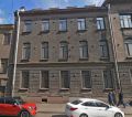
Examples of simple facades:
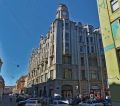
Examples of complex facades:
Contents
Prerequisites
- Decent PC. It is recommended to have 16+ GB RAM, fast SSD drive with 20+ GB free space (used for temporary Photoshop data) and a good CPU. Otherwise working with huge textures can be hard.
- Not too old Photoshop with CameraRAW or Lightroom. CC 2014 or newer should work. If RAW files cannot be opened, try updating CameraRAW.
- Any modelling program suitable for low-poly (Max/Maya/Blender).
Time constraints
Simple can be done in 1-3 days, complex can take up to a week. Work should be planned in advance to not exceed this time. It is important to focus on overall decent look of the building without going into too much detail on individual parts.
Approach
Priority
Facades need to appear natural/realistic under soft (baked) sky lighting. Most of the city is in shadow. Ideally they should appear like high-resolution seamless scans, while, at the same time, using only a fraction of required memory. To achieve that, building is split into logical repetitive and unique modules, each of them only created once and then copied/tiled if needed. Because of lighting softness, correct normal mapping and chamfers are mostly unimportant and avoided unless the surface is very bumpy or chamfered. Clean, sharp diffuse textures are the key.
Workflow steps
Analysis
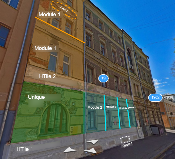
Inspect the facade and note repetitive parts. Try to see how many unique elements it consists of.
Facades can be split into:
- Modules. Usually part of a wall with a window. Often can be repeated for the whole floor.
- Horizontal tiles. Usually bottom, mid-floor and cornice parts. They are usually just stretched/tiled for the whole width of the wall.
- Unique parts. Special elements that don't repeat.
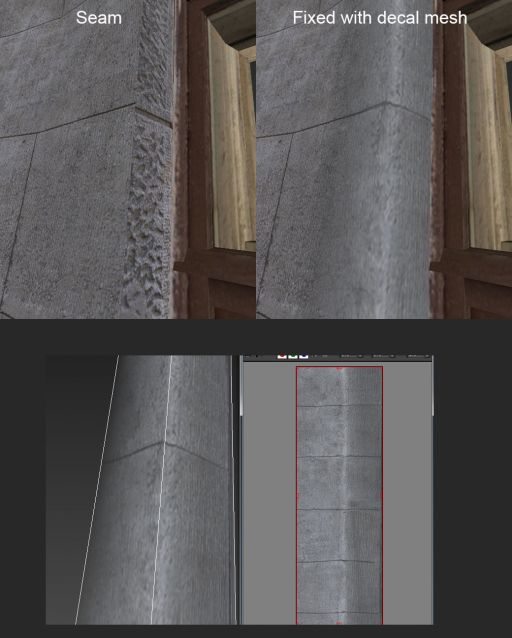
- Decals. Anything that is slapped on top. Decals simplify the workflow by decoupling clean tiled base from interesting non-tiled details. Vents, unique/noticeable dirt or paint splats. Often decals can help hiding a seam between two parts.
For every element
Choosing best photos
For every element, the whole set of photos should be inspected for best (resolution, focus, no motion smearing, direct angle) images. Sometimes only one photo is enough. Sometimes multiple photos can be stitched together.
For repetitive parts it is best to choose cleanest, most featureless photos (ones with less special details, dirt) as feature repetition can be noticeable. Features can be added later on top as decals.
For horizontal tiles it is often a good idea to stitch multiple photos that will span multiple windows to avoid visible tiling.
RAW tweaking
RAW files store higher dynamic range than JPGs, so naturally any shadow/highlight and white balance tweaking should happen at this stage. Photos need to be made as flat albedo-like as possible. Because models will be low-poly and because there is no separate detailed occlusion/normal map, occlusion around small crevices and details should be left. However, large-scale occlusion and lighting needs to be removed/flattened.
Photos should look as if they are lit with white uniform light from all sides. They shouldn't look either too dark or ever-exposed.
If using Adobe CameraRAW, usual steps are:
- Boost up Shadows (often to +100, unless it distorts colors too much)
- Tweak Exposure
- Boost up Blacks a bit if boosting Shadows is not sufficient.
- Find a reference of plain white/gray surface, select all photos and use White Balance tool to remove warmness/coldness from them and make them neutral.
Note that in CameraRAW, Exposure and Shadows (unlike Blacks and White Balance) work locally for every photo. That means setting the same value for multiple photos can still yield different results (even though they are shot with identical camera settings). Make sure photos look similar to each other, some need individual tweaking.
Opening RAWs
RAWs should be then either converted to JPGs with maximum quality or just opened directly in Photoshop as 8-bit images.
When converting, make sure that image color profile is set to sRGB. If opening directly, do Edit->Convert to Profile->sRGB.
If multiple images need stitching, convert them to JPG, then go File->Automate->Photomerge->Perspective. Combined stitched image will be generated.
Fixing perspective distortion
Add guides around supposedly straight lines and distort the image to make them straight. When distorting, image should be made larger (smaller sides will expand) rather than smaller.
Cleaning and tiling
Usually the longest process and there are many ways to achieve the result. Most used tools: Context-aware fill, Clone stamp, light use of Dodge and Burn and just simply separating parts of the image with softened lasso and applying different adjustments (brightness, contrast, saturation...) to them.
Texture resolution needs to remain as high as photos can offer. For stitched photos resolution can exceed 8k - this is fine.
Some small parts of the wall can have visible perspective distortion - these should be either corrected (with low-poly UV mapping in mind) or removed.
Large-scale lighting can also be removed at this stage if RAW tweaks weren't enough.
Some good tricks: http://wiki.polycount.com/wiki/Tiling
Especially:
http://www.twisted-strand.com/ut_tutorials/text_tut/index.html
http://wiki.polycount.com/wiki/ValueCorrection
Additionally, automatic delighting tools (such as free Agisoft De-lighter - you can supply a simple textured plane as mesh) can be used occasionally, but most of time they don't do a good job, removing too much of desired small-scale occlusion.
Saving textures
Final textures should be saved as 24-bit (RGB) or 32-bit (RGBA) TGA. Alpha channel should be defined as a separate channel, rather than Photoshop transparency. This will allow more control over the mask as well as semi-transparent colors.
Texture names must only contain latin letters, numbers and underscores. Texture names must be prefixed with building name that is the same for all parts of the building, e.g.: greenbuild_wall1.tga.
Modeling
After the texture is done, element can be modelled and mapped. Usually a plane is textured, sliced, distorted and extruded. Then UVs are corrected.
- UVs shouldn't exhibit extreme stretching
- UV seams should be avoided or hidden as much as possible. Use real photographic edges where surfaces connect.
- Contact lines between different elements should appear seamless (at least without lighting).
- Complex geometry like sculptures is still modelled directly as low-poly. Exceptions are street-level details (too close to camera) - these can be properly photoscanned and should be discussed in advance.
It is only important to model/texture faces visible from street level. Upward-facing polygons above 2nd floor can be omitted/unmapped.
Metric scale can be assumed by treating windows as 2 meters tall. Usually when model is copied carefully from reference with elements correctly connecting to each other, inter-element proportions will be correct and overall scale can be easily tuned later.
Applying decals
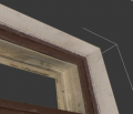
In this workflow decals are meshes of any shape that conform to underlying geometry but have independent texture/UVs. Decals can depict distinct elements, break tiling or hide seams. They can be pushed away from the base surface a bit to avoid flickering (z-fighting). Game tools/shaders will process decal geometry and alleviate any gaps.
Decals can use transparency from both texture alpha channel and vertex color. Vertex color (black to white) can be used to easily fade decal edges in engine.
Adding windows
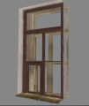
All window frames in the city are the same modified template mesh. They are all wooden, have double frame (outer and inner) and a metallic exterior sill. Generic walls surrounding the frame are also part of the template. Windows use a texture atlas with different variations, swappable via UV offset.
By simply changing template proportions and copying/deleting parts, reference shape can be achieved.
Adding props
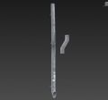
Common props, such as drain pipes and stairs are already pre-made. Anything extra should be discussed in advance.
What not to do
- High-poly sculpting.
- Baking anything.
- Packing textures to atlases. Textures will be automatically packed/optimized.
Preview rendering
When checking quality of the model, render it with high enough resolution (1920x1080 or larger) so all details are visible; it is important to check both unlit and sky-lit look. In Max, it's a good idea to switch between Shaded and Consistent Color viewport modes when modeling and use Skylight (5 samples are enough) for rendering. Put a large plane beneath the building, so sky lighting doesn't come from below. Disable shadow casting on decals.
Test facade
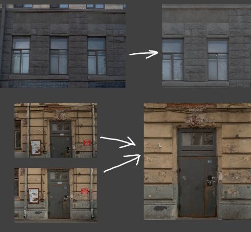
You can try your skill on one module of one particular facade.
Photo set. All photos are 6000x4000.
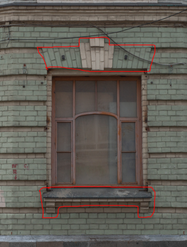
Try making this module (wall with a window) on the first (ground) floor. Because there are different window sizes, wall tile can be separated from details around the window:
